Tuesday, April 21, 2009

ICONIC MAP


This is an inconic map of the City of Fremantle. Located on the map are numbers 1-15 signifying the important, main places of the city. Below the map are the destinations of number on the map.


Map url: www.emeraldinsight.com/fig/0670360917001.png

GEOLOGIC MAP


A geologic map can help a geologist see the Earth's rocks that lie on the surface.
This geologic map is of Texas during the year 1992. The three eras are broken down as the map's legend. Each rock has it's own color pattern during it's time era. For instance, during the Mesozoic era, the rock patterns are shades of green.


Map url: geoweb.tamu.edu/.../grossman/GeologicTX.jpg

CLASSED CHOROPLETH MAP


Featured on this map is a comparison of males per 100 females based on the US 2000 Census. There are only four basic colors on the map breaking down the data classes.


Map url: http://my.ilstu.edu/~jrcarter/Geo204/Choro/map-AmFact-4eqint-orange-80pct.jpg

BIVARIATE CHOROPLETH MAP


This is a Bivariate choropleth maps of Africa. It is showing the "Land Use Life Expectancy, and GNP Per Capita in Africa 1989." The continent is broken up by varying colors which are defined in the block legend. There is also a pie chart to further demonstrate the information presented in the bivariate choropleth map.


Map url: www.geocities.com/.../Africa_Choropleth.jpg

LORENZ CURVE


A map that I have not familiar with, a Lorenz Curve shows income distribution with it's curve. This Lorenz Curve featured showing Scotland's income fairness. The chart is a guide to helping get to that fairness to please the SNP.


Map url: www.northlan.gov.uk/.../lorenz+curve.jpg

HISTOGRAM


The image example of this histogram is depicting final exam results for a fake class. The score range is denoted by different colored bars. The X axis is the score on the final exams while the Y axis is the number of students.


Map url: media.techtarget.com/.../Misc/iw_histogram.gif

PARALLEL COORDINATE GRAPH


Parallel coordinate graph that is seen here is of baseball statistics. This type of graph is so that one can "plot large multivariate datasets." The top Y Axis on the parallel coordinate graph represents "The League Leaders for the Stat" while the X axis represents "A Zero value for all State."


Map url: www.matthewtavares.com/.../graph_allteams.bmp

INDEX VALUE PLOT


This index value plot is explaining the "Streamflow Conditions Plots." The red lines on graph are plots for the average streamflow. It is showing the every day average of the water resource region or the gaging stations over 30 years. You may notice there are gaps in the map which signify days where there was less than 2/3 reported data from the stations.


Map url: water.usgs.gov/.../regplots/real/real_us_2.gif

ISOHYETS


Isohyet maps have lines which connect places that have the same amount of rainfall.
The map that I have included here an Indian Isohyet. The information featured came frim the Indian Government 1975, ICRISAT 1978, Subrahmanyam et al. 1965.


Map url: www.unu.edu/.../unupbooks/80391e/80391E00.GIF

ISOTACH MAPS


This is a Streamline Isotach map of Taiwan. Using the meteorological information from the August 23rd weather forecast, this map was created to show the pattern.


Map url: http://tparc.cwb.gov.tw/data/model/Operation_CWB-WRF_45km/20080823/model.Operation_CWB-WRF_45km.200808231800.048_200hPa_Streamline_Isotach.gif

DOT DISTRIBUTION MAPS


This image of a dot distribution map is of the United Kingdom. There are several destinations marked by red and pink circles and dots to indicated places featured on the right-hand side of the map. This is also just a general map of the UK, not a specific one.


Map url: ourworld.compuserve.com/.../genmap2.gif

PLANIMETRIC MAPS


Planimetric maps are digitaL maps that show planimetric features using symbolism mixed with lines to show position in a horizontal manner. These maps are mostly used for transportation plans. The planimetric map here is an image of Sayville High school area. The entire area surrounding the actual is only in black and white. The only splash of color on this map is the school in purple.


Map url: www.chipr.sunysb.edu/.../images/sayPlanMap.gif

PLSS MAP


This PLSS map is a part of Minnesota's statewide PLSS map. The area is a fraction of a Worthington quadrangle on a 1: 100,000 scale. It is an example of cadastral data. The smallest blocks on the map are representative of quarter quarter sections. The numbers in black are codes. Red words and numbers indicate Town and Range lines.


Map url: www.fairview-industries.com/.../mn-exmpl.htm

Sunday, April 19, 2009

BILATERAL GRAPH


This bilateral graph has an X and Y axis of persons and fiscal year. The bars on this graph are comparing acceptance of trainees, dispatch of experts, and dispatch of JOCVs apparently from 1994-1998.


Map url: www.mofa.go.jp/.../pamph/2001/oda.html

STATISTICAL MAPS


This particular statistical map is of the international connectivity of the Internet. It is showing the connection position during the month of June during the year 1997. There is an obvious connectivity level therefore we can conclude that the Internet was becoming increasingly popular.


Map url: personalpages.manchester.ac.uk/.../census.html

THEMATIC MAPS


Thematic maps are helpful to someone who wants to see " census data in graphical format." This image that I have is based on New York City, New York 2000 demographic profiles. The legend breaks down age in various shades of green.


Map url:www.lib.wsc.ma.edu/censusaff.htm

CHOROPLETH MAP


Titled "Minority Group with Highest Percent of State Population" is the map that I picked as an example of a choropleth map. It uses color codes in the maps legend as to distinguish the different minority groups: Hispanic (green), Black (gray), Asian (yellow), Asian (HI) (blue), and two or more races nonHispanic (orange). It is amazing to see the growth of Hispanic minorities who have taken over the entire West coast.


Map url:https://courseware.e-education.psu.edu/courses/geog862/images/citationexample.jpg

CARTOGRAPHIC ANIMATIONS


This cartographic animation is titled "Cancer Deaths by Nebraska County, 1996." Although the map is in black and white, there are color squares on the side that can show different data on the map. The main parts of important information featured are classed, unclassed, heart disease, cancer, chronic lung, and cerebrovascular. Each area on the map has also been broken down by percentage through a gray scale.


Map url:http://maps.unomaha.edu/AnimArt/ActiveLegend/JavaScript/Cancer1.gif

TRIANGULAR PLOT


This triangular plot is depicting "carbonate rock composition" representing clays, carbonates, and silica. The different rock compositions were made from rock analyses. The information here is from three states: Pennsylvania (Vanport and Loyalhanna Limestones), West Virginia(Stones River and Tonoloway Limestones), and lastly Tennessee(Monteagle and Warsaw Formations).


Map url: http://www.speleogenesis.info/archive/sg2/White/img/SG2_White_basins_f10.gif

CORRELATION MATRIX


This image is the "Correlation Matrix Pearson Correlation Coefficients / Significance / Number of Observations." It is showing the correlation among M variables. All variables that are equal to themselves are 1.00 such as the SOL in the image.


Map url: www.kltprc.net/policynotes/Gifs/Tab_005A_4.htm

SCATTER PLOT


This scatter plot has been taken from an Army training site. A scatter plot is used to investigate a relationship that may exist between two variables in relation to the same "event." It has an X and Y axis. Here the X axis of the SAT vs. Beta Test scatter plot is Beta Test Adjusted Score while the Y axis is SAT V+M.


Map url: www.army.mil/ArmyBTKC/focus/cpi/tools3.htm

DEM MAPS


The image that I have chosen to represent a DEM (Digital elevation model) map seems rather cloudly in view. It is showing a gray level relief map. Composed using1:250,000 DEM information, of the Sierra Nevada Mountains' Susanville area.


Map url:www.fas.org/.../docs/rst/Sect11/Sect11_5.html

POPULATION PROFILE


This population profile is of Howard County's population 2007 Community Needs Assessment. Using line graphs, this image is showing population growth from 1970 to 2006 from what is actual growth, US growth, and IN growth.


Map url: www.unitedwayhoco.org/needs/population.html

Saturday, April 18, 2009

DOPPLER RADAR


Doppler radar popular in determining weather patterns. This image is showing the Canadian environment. The colors that are present on the radar are known as Velocity-Azimuth Display. These colours are essential because they help decide what the images and values are and what they mean.

Map url: http://www.stuffintheair.com/images/DopplerRadar.gif

NOMINAL AREA CHOROPLETH MAP


This nominal area choropleth map is showing access to safe drinking water.
"values are rendered" for areas and are calculated for area. The color scheme is what signifies the difference in wonder.


Map url: http://menris.icimod.net/UserFiles/Image/capacity%20building/elearning/Figure%208_3b.jpg

ISOBAR


This map is showing how isobars can be parallel to one another. It is also displaying the effects of changing pressure over a mass area, but steadily. The isobars here represent horizontal pressure changes and how they will adopt a "banded appearance.


Map url:www.newmediastudio.org/.../Closed_Isobars.html

DOQQ


A Digital Ortho Quarter Quad or DOQQ for short is an image with ""properties of an orthographic projection." The one here comes from the UTM county in Tennessee. It is a black and white aerial shot of zones 15, 16, and 17.


Map url: www.tngis.org/doqq.html

INFRARED AERIAL PHOTO


The infrared aerial photo here is of the Aundance Ecovillage as well as the surrounding land in 2002. It has been noted in the image's caption that it is a color infrared aerial photo as oppose to a black and white one.


Map url: www.abundance-ecovillage.com/.../PhotoTour

TOPOGRAPHIC MAPS


Topographic maps use planimetric aspects like symbolism and lines. They are also digital and graphic with horizontal positions.
This image is a part of a processed topographic map with ratio 1:25000. This 1:25000 has been changed from an "environment software Microstation, topologically adjusted for GIS Arc/Info usage" which was then added to 1:100000 map scale's information.


Map url: http://tp.dgs-gis.cz/images/bigones/polohopis.jpg

CADASTRAL MAPS


The cadastral map that I have chosen here is depicting part of the a map with "bonded evidence database, where the parcel classification under a database field “land usage” has been done."


Map url: tp.dgs-gis.cz/polohopis.php

HYPSOMETRIC MAP


This image is a hypsometric map of Tajikistan. Tajikistan's hypsometric is showing the Central Asia's surface elevation which varying shaded colors of red.


Map url: www.rrcap.unep.org/centralasia/reapreport/map.cfm

CLIMOGRAPHS


This particular climograph is showing the monthly precipitation and temperature conditions for Russellville, Kentucky. The time frame displayed is 1971-2000 being represented by both a bar and line graph. The temperature is marked by the separate line graphs while the precipitation is marked by the bar graph.


Map URL: kyclim.wku.edu/stations/157049_top.html

SIMILARITY MATRIX


A form map that I am very foreign to, a similarity matrix expresses the likeness of two point by using a matrix. The picture that I have added shows us "completely sequenced organisms." All of these organisms come from genome conservation.


Map url: www.mbio.ekol.lu.se/staff/dag/dag.html

STEM AND LEAF PLOT


Very familiar to most of us, a steam and lead plot has stems that are represented by digits that are the greatest place value while the leaves are the next greatest
place value. The image here is showing us the infant mortality death rates in western Africa. Most of these values are between 100 and 175.


Map url: mainland.cctt.org/.../stem-and-leaf_std.htm

BLACK AND WHITE AERIAL PHOTO


This beautiful photograph is a black and white aerial view of Kansas City's interstae i-70 and i-35. Obviously unlike color photo, black and white aerial photgraphs are shot from above the subject and are colorless.


Map url: isaacalongi.com/aerial-art-vs-aerial-photography/

PROPAGANDA MAPS


This map titled ‘Outline of (the) Post-War New World Map’ is trying to convince others that small powerful ententes should having ruling of the world. It was a proposal made during WWII after the Axis were defeated by Allied forces.


Map url: strangemaps.wordpress.com/2008/06/

PROPORTIONAL CIRCLE MAPS


This image is actually the outcome of "how to" create a proportional circle map. It is very simple in yet very informative. The legend on the map is based on points that were determined by population.


Map url: jeffhobbs.files.wordpress.com/2008/03/3.gif

Thursday, April 16, 2009

DRG MAPS (Digital Raster Graphic)


A part of the Washington West, D.C. is being shown by this DRG map. Every part is distinguished by separate colors that distinguish the parts of the map.


Map Url: egsc.usgs.gov/isb/pubs/factsheets/fs08801.html

ISOPLETH MAPS


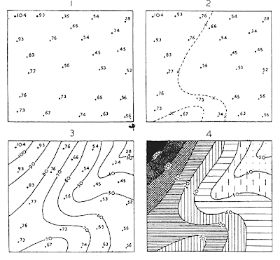
The following map that I have included is showing how isopleth maps are constructed using points 1 through 4.

Here is a featured breakdown of each point.

"1. The point-values are located
2. the critical isopleth of value 70 is interpolated, with the aid of crosses placed between pairs of values at a distance proportional to the value of each
3. other isopleths are similarly interpolated
4. a system of density shading is applied for clarity between the isopleths."

Map Url: www.fao.org/DOCREP/003/T0446E/T0446E06.htm

ISOPACH MAPS


The image protrayed in this isopleth map is displaying the areal thickness of Silurian evaporite basins. These basins can be found in the Great Lakes area


Map url: higheredbcs.wiley.com/.../chapter10-06.html

CARTOGRAM MAPS


These particular maps may differ in their size when showing geographic area. Area and distance cartograms are the two different types of cartogram maps. Spatially these maps are distorted so that they can show the alternate variable information.

This particular map is showing us population.

Map url: www.mscd.edu/.../1220cardiograms/index.htm

Wednesday, April 15, 2009

WIND ROSE


A wind rose is more of a graphic insturment commonly used by meteorologists to give a compact display of how direction and wind speed are usually allocated at a particular location. This image depicts wind speed measured by knots. The various colors of speed are expalined in the map legend.


Map url:http://www.climate.washington.edu/windrose/Seattle-WindRose.jpg

STAR PLOTS


Star plots show us multivariate observations with a subjective variables. Each observation is displayed by a star-shaped design with one ray for each variable. This image is the variable assignment for the featured starplot.


Map url: www.math.yorku.ca/SCS/icons/sugi16/starkey.gif

CONTOUR MAPS


Contour maps are created using contour lines. These maps take separate measurements, interject between them with the intent to create a grid that is uniformed. These measurements are then shown as lines of constant values. This map shows the high temperature predictions during June 27th. The legend shows the meaning for each color temp. of each state.


Map url: www.geomem.com/.../mapviewer/ContourMap.png

FLOW MAP


At some point in our lives, we have all used a type of flow map. Flow maps depict object movement from one place to another place. These maps are mostly done by hand and a good tool to use due to the fact that they merge edges with the reduction of of optical fill. This flow map is showing how quickly satellites would spread during the year 2006 across the US.


Map url: www.mpassociates.gr/.../golden/FlowMap.gif

ISOLINE MAPS


There are several examples of Isolines maps, maps that have joint lines which all have same value points. These lines are also nonstop. Different examples of an isoline map would be a contour map and thematic map. This isoline map is of annual precipitation.


Map url: menris.icimod.net/.../Figure%208_3c.jpg

MENTAL MAP


Mental maps shows us inside the human mind, tracking the places that they have been visually. Each person has their own and no two maps are the same. This mental map is a little difficult to see, but it is of a center. It was drawn from a person's memory of what the area looks like.


Map url: www.fedstats.gov/.../graphics/mental.jpg

Friday, January 30, 2009

DLG MAP


The image you are seeing is that of a DLG map. DLG stands for digital line graph. The image I have depicts the properties of the United States broken up into territories. For example, Florida has been seperated as an individual state while Georgia has been clumped into the Southeastern states.

I love this type of map because it easy to read and it has my intials.


Image link: http://www.versamap.com/webdoc08.htm